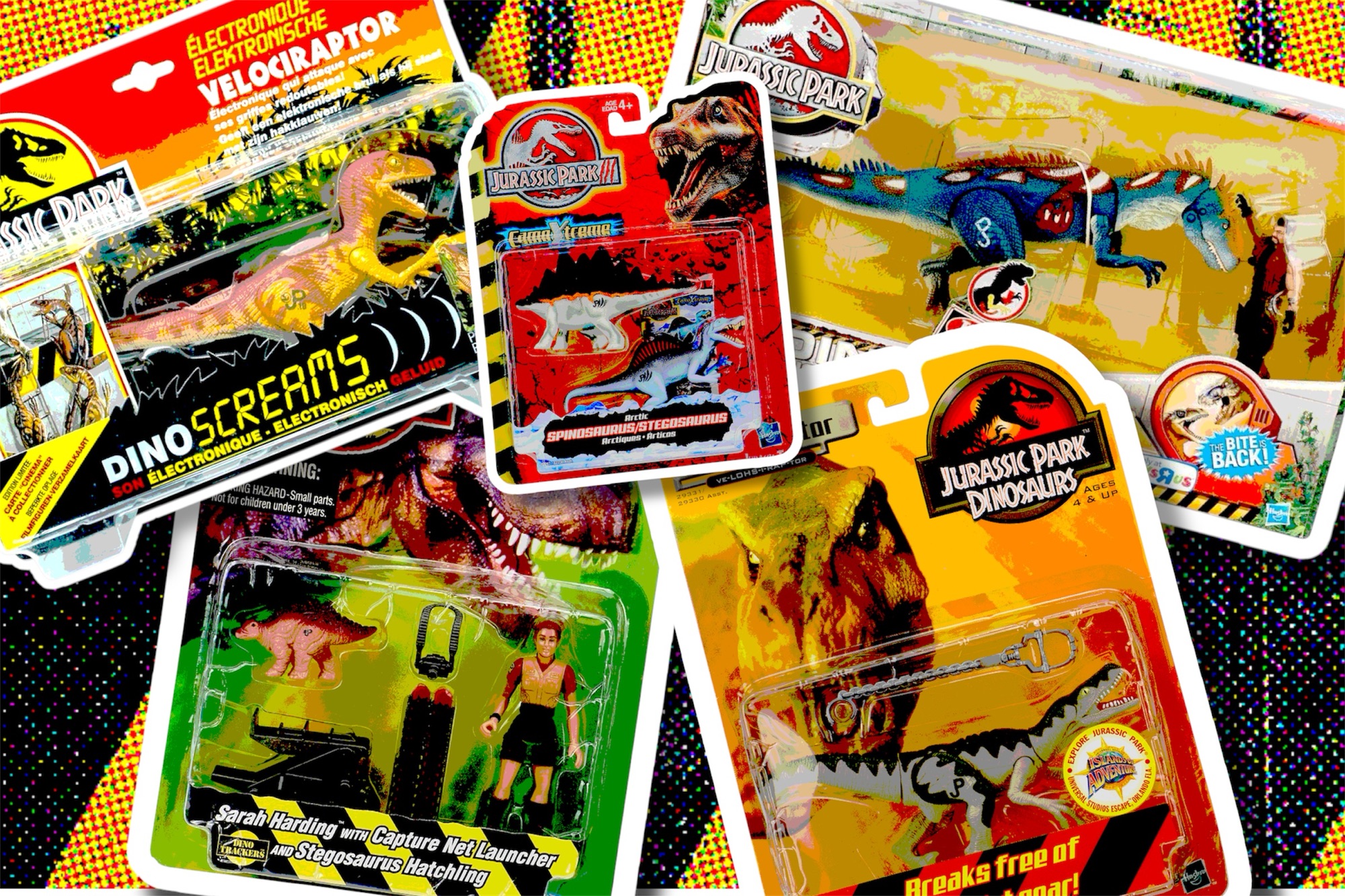
When it comes to Jurassic Park toys, the packaging is almost as iconic as the dinosaurs themselves. Over the years, the design of the boxes evolved alongside the movies, reflecting different trends, moods, and branding strategies. From bold jungle scenes to futuristic graphics, each era tells its own story
Take a look at this visual overview of the Jurassic Park packaging era, from 1993 to 2013.
1993: Jurassic Park (Kenner)

Right: Dimetrodon (Jurassic Park, Namura Toys, 1993)
The original Jurassic Park toy line set the standard: a sunset background, the jungle silhouette, and the legendary Jurassic Park logo on the top left. This is one of the most recognizable toy packaging designs ever.
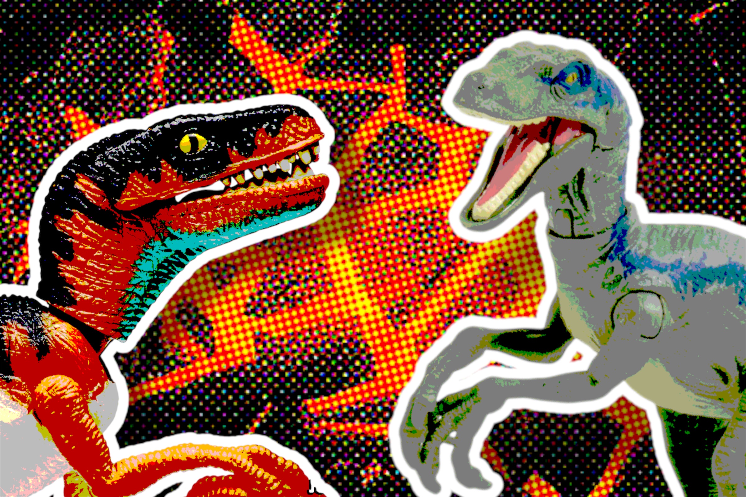
1994: Jurassic Park – series II (Kenner)


Right: Dennis Nedry (Jurassic Park series II, Kenner, 1994)
Kenner added a striking blue gradient to the series II toyline, signaling to buyers that these were fresh, all-new additions to the Jurassic Park toy line.
1997: The Lost World: Jurassic Park (Kenner)
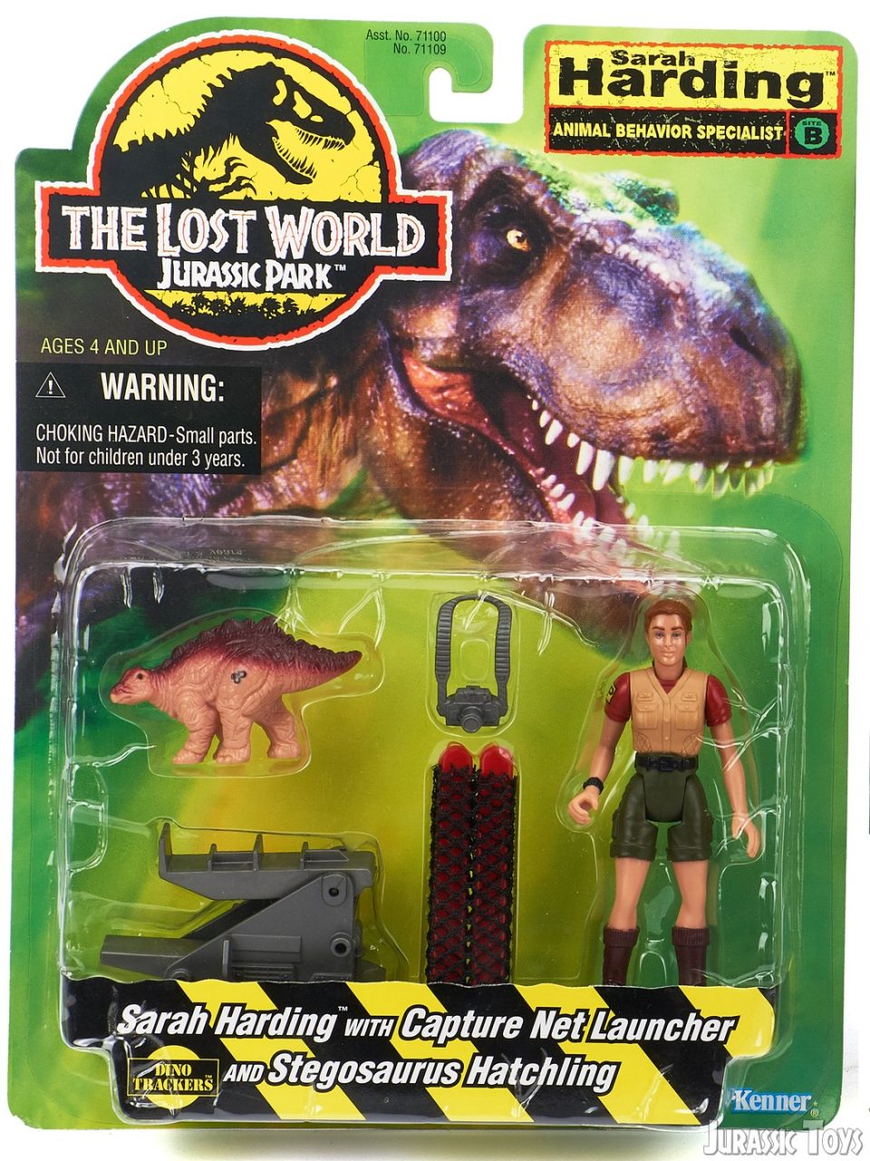

Right: Baryonyx (The Lost World: Jurassic Park, Kenner, 1998)
For The Lost World, the packaging shifted to a vibrant, overgrown jungle green, featuring a promotional image of T. rex, a cracked stone logo and heavy hazard striping. It captured a wilder, more chaotic atmosphere — perfectly matching the film’s darker, untamed tone.
1998: Jurassic Park: Chaos Effect (Kenner)


Right: Compstegnathus (Jurassic Park: Chaos Effect, Kenner, 1998)
Kenner got experimental with Chaos Effect, introducing neon colors, blacklight purples, and wild creature designs. The packaging reflected this chaos with vibrant, almost sci-fi backgrounds and the same heavy hazard striping that was used the year before for The Lost World: Jurassic Park.
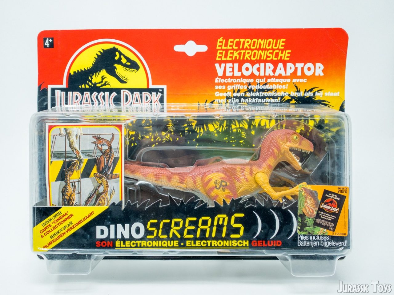
1999: Jurassic Park Dinosaurs (Hasbro)


Right: Velociraptor (Jurassic Park: Dinosaurs, Hasbro, 1999)
The Jurassic Park: Dinosaurs line consisted entirely of repaints from both the Jurassic Park and The Lost World toy lines. These figures were sold exclusively at Wal-Mart and Universal Studios theme parks. The packaging drew inspiration from The Lost World design, but swapped the jungle greens for bold orange tones. Some figures featured an Islands of Adventure sticker, promoting the newly opened theme park in Orlando.
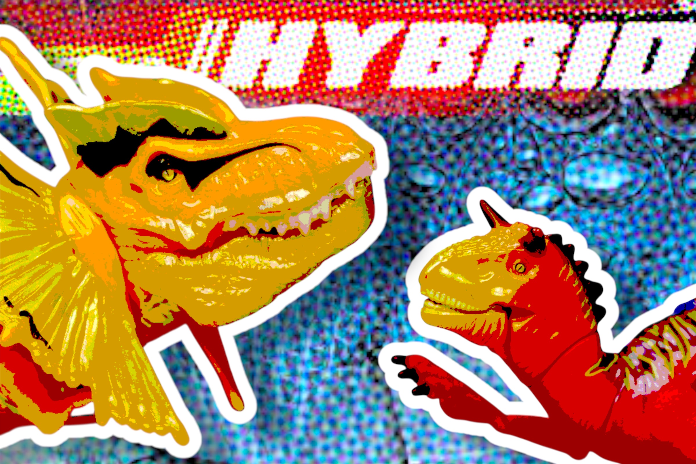
2001: Jurassic Park III (Hasbro)


Right: Arctic Stegosaurus and Spinosaurus (Jurassic Park III Camo-X-Treme, Hasbro, 2002)
Jurassic Park III introduced a sharper, more intense look. The packaging turned bright red with textures resembling cracked earth or rock, and the iconic hazard striping made its return.
For the Camo-X-Treme line, the second wave of Jurassic Park III toys, a new subline logo was added, along with design elements inspired by the environments where the dinosaurs lived, giving each package a unique, location-based feel.
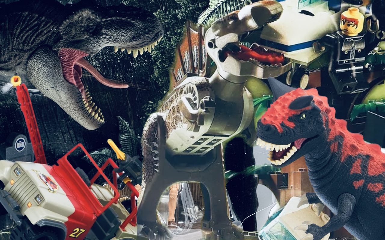
2009–2011: Jurassic Park Dinosaurs (Hasbro)
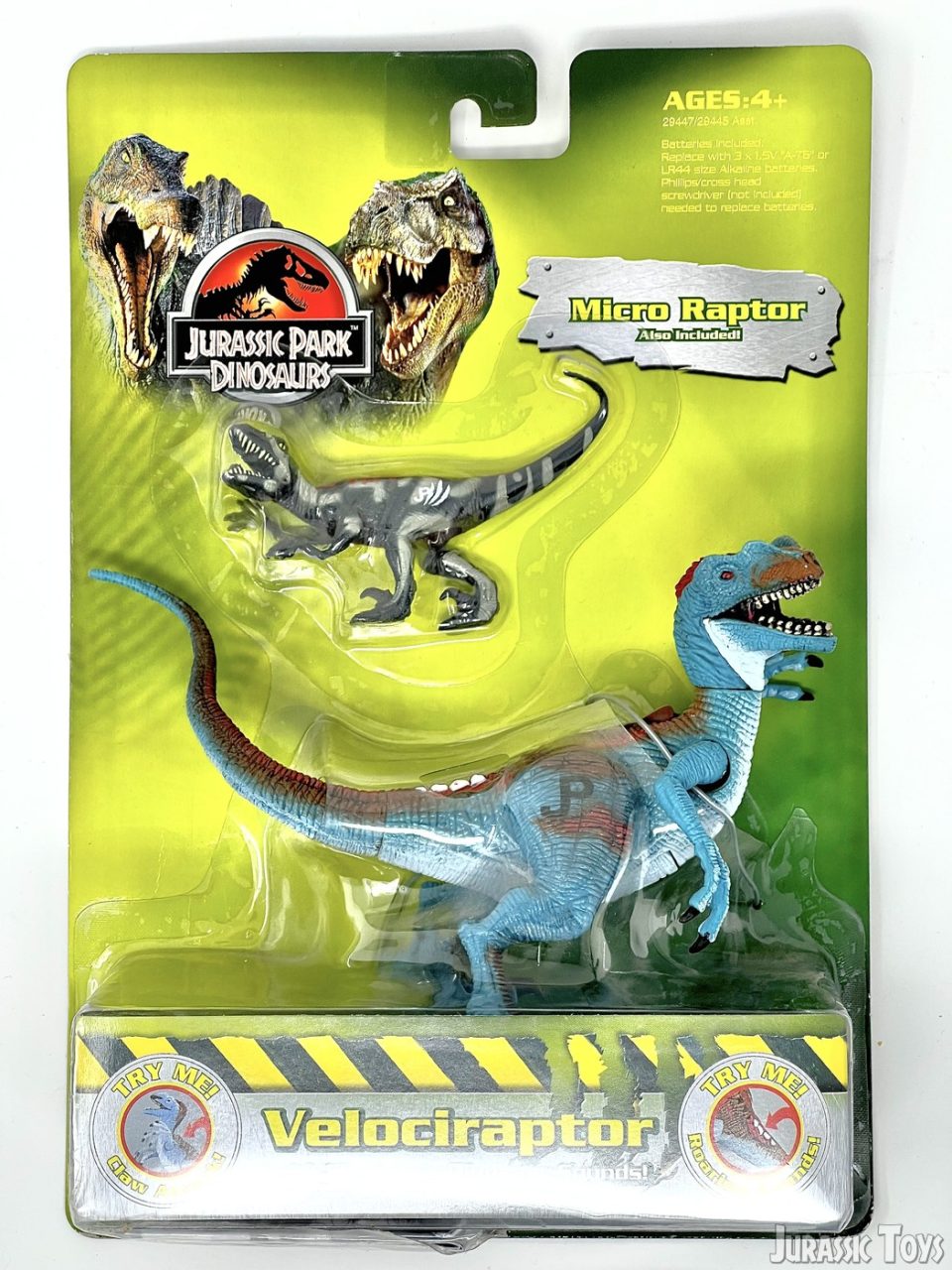

Tyrannosaurus (Jurassic Park: Dinosaurs, Hasbro, 2004)
Hasbro revisited the Jurassic Park: Dinosaurs branding, this time featuring green cardbacks and a new logo depicting a roaring Spinosaurus and T. rex. The entire line was designed to be budget-friendly for K.B. Toys, which led to a more basic packaging design and the use of cheaper materials, such as thin cardboard backings.
2013: Jurassic Park: Dino Showdown (Hasbro)

Hasbro returned to the Jurassic Park brand with Dino Showdown, introducing all-new dinosaur sculpts and human figures inspired by the G.I. Joe line. The goal was to breathe new life into the franchise’s toys. Packaging took inspiration from overgrown Jurassic Park fences, giving the boxes a rugged, abandoned feel.
Why Packaging Matters
From the fiery sunsets of 1993 to the neon chaos of 1998 and the detailed design of 2013, Jurassic Park packaging has always been a window into the spirit of the brand at that moment in time. For collectors, the cardbacks and box art aren’t just backgrounds, they’re part of the thrill of collecting.

So the next time you pick up a figure, take a moment to appreciate the era it came from. Because in Jurassic Park… even the boxes have a story to tell.