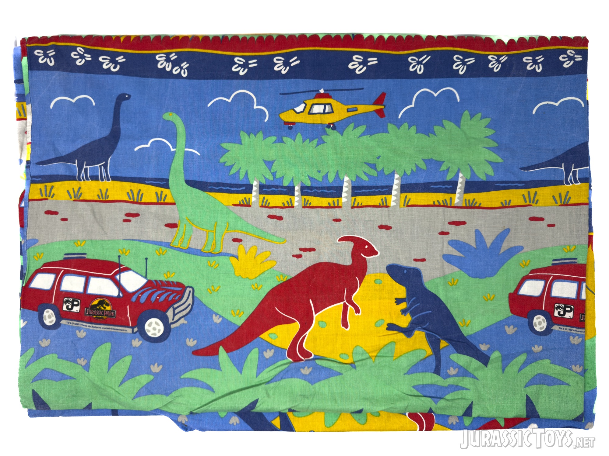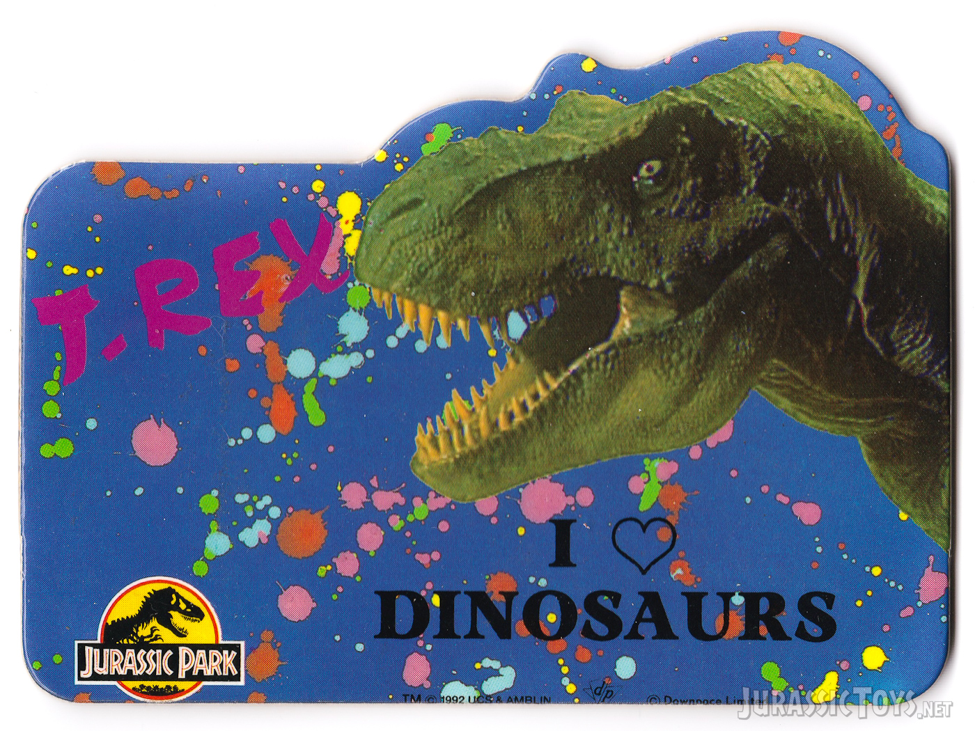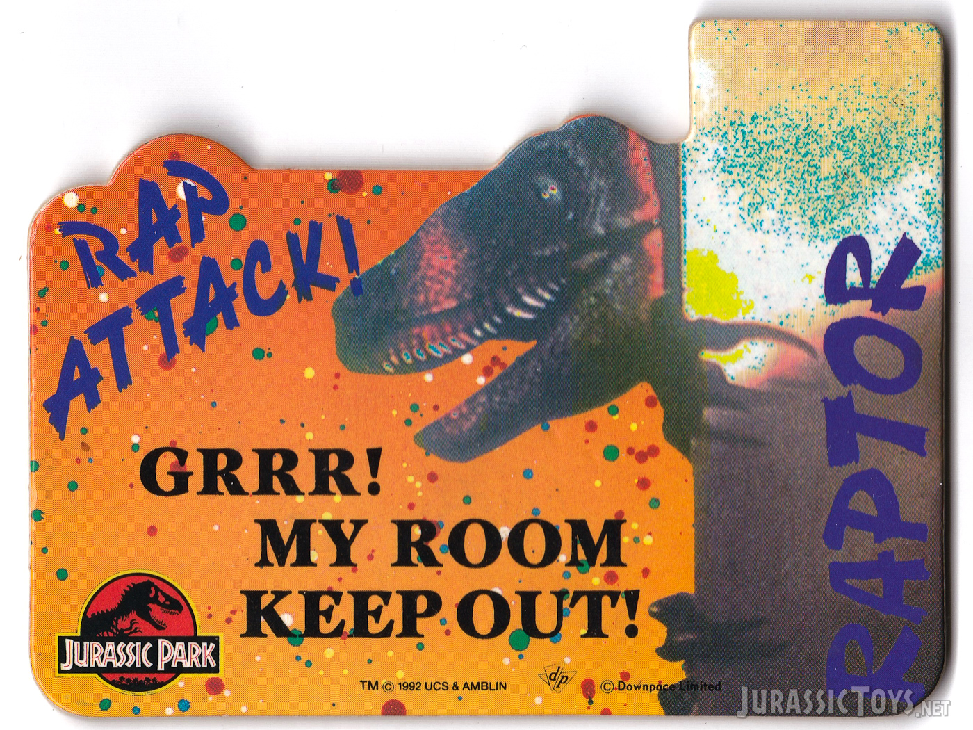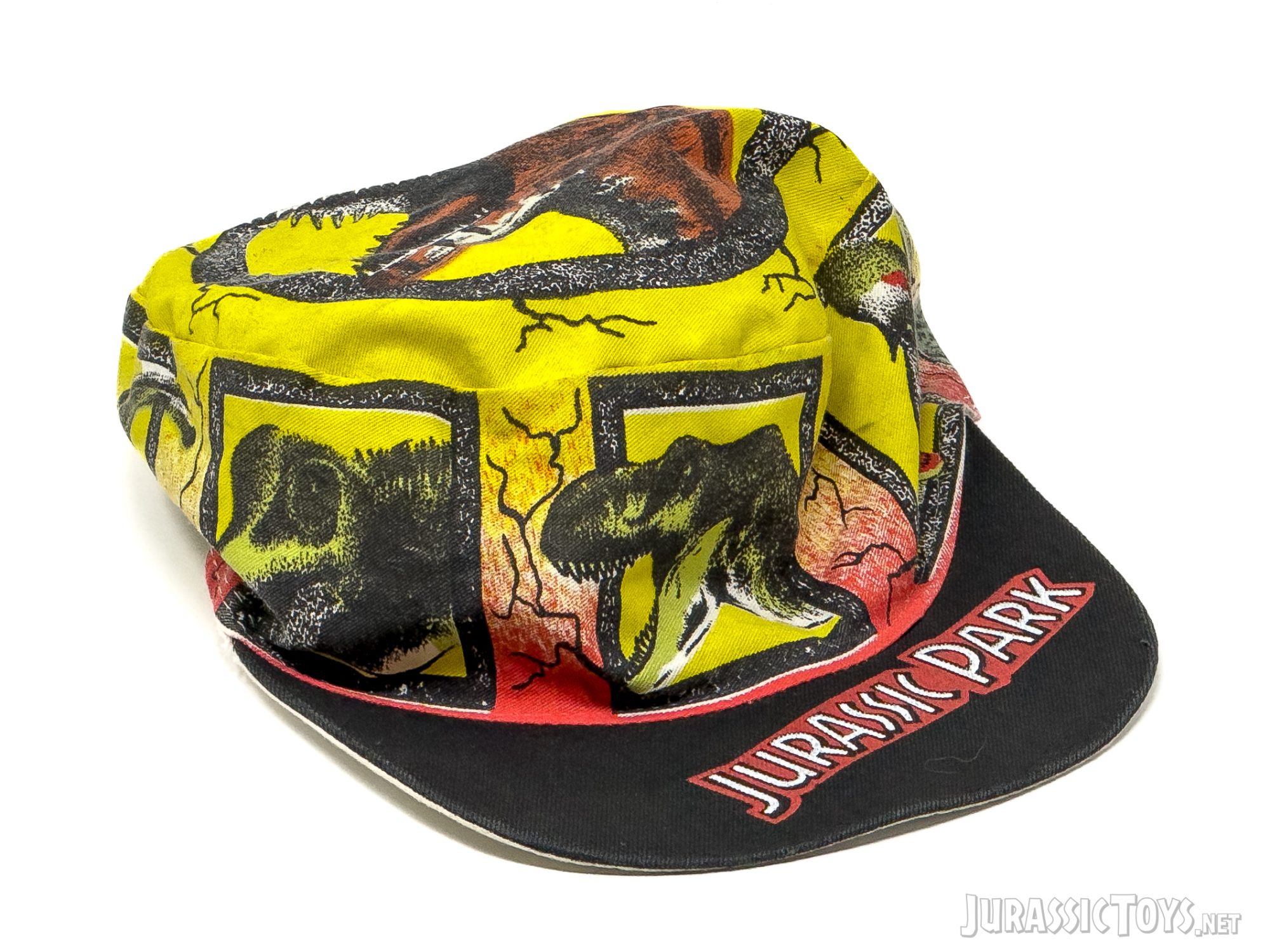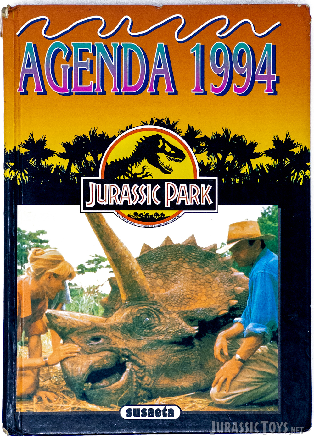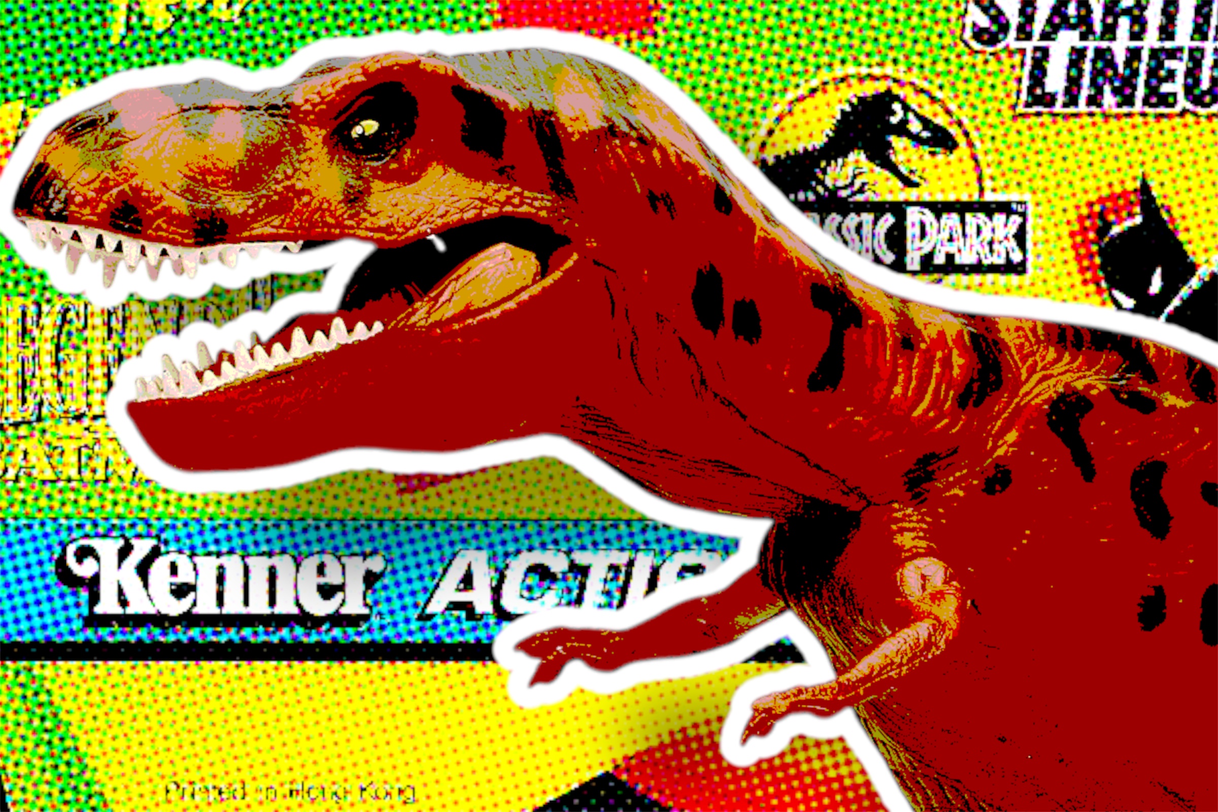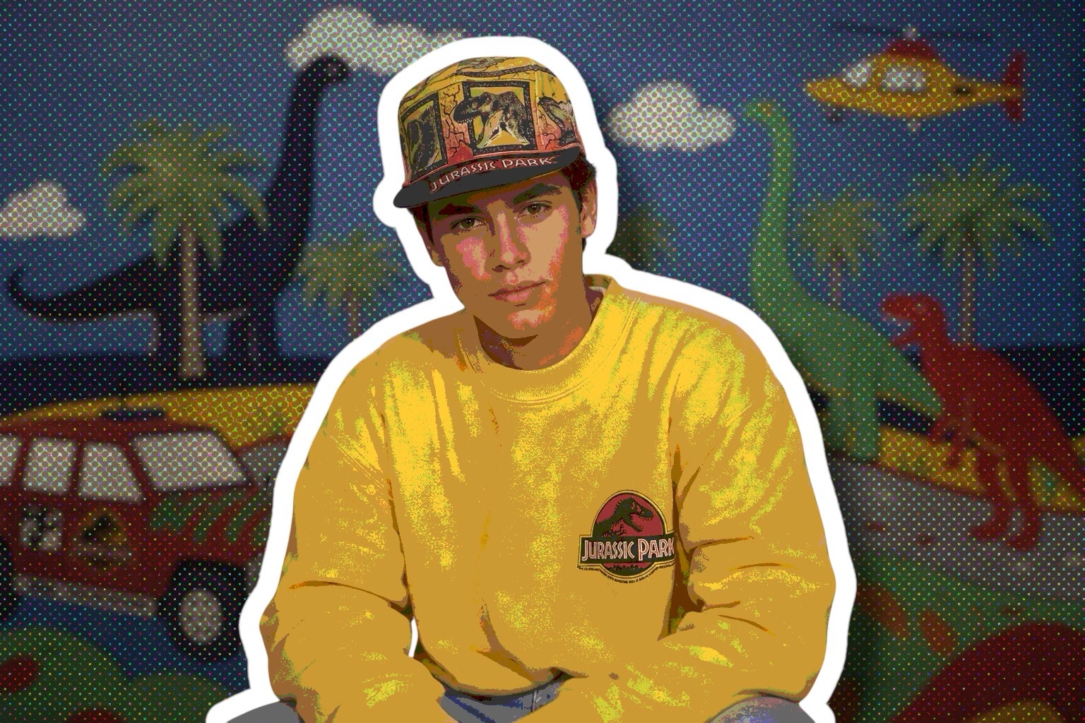
In 1993, Jurassic Park merchandise always carried that unmistakable Universal Consumer Products look: the iconic sunset, the palm trees, and the classic logo framed in a way that instantly evoked adventure, danger, and tropical mystery. That visual formula became part of the brand’s DNA, giving even the simplest item a cinematic feel. It was polished, dramatic, and consistent, a design style that made Jurassic Park feel like a place you could step into, not just a movie you had watched.
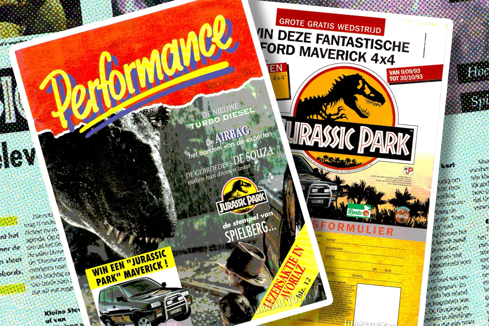
But in the 90s, that official Jurassic Park style sometimes collided with the decade’s own design language, and that is where things became especially interesting. Bright colors, oversized type, playful compositions, and bold graphic choices would take over, giving the merch a rawer and more expressive personality. The result is a perfect mix of branded consistency and pure 90s energy: tropical sunsets on one side, loud toy-aisle nostalgia on the other. That tension is exactly what makes these pieces so memorable today.
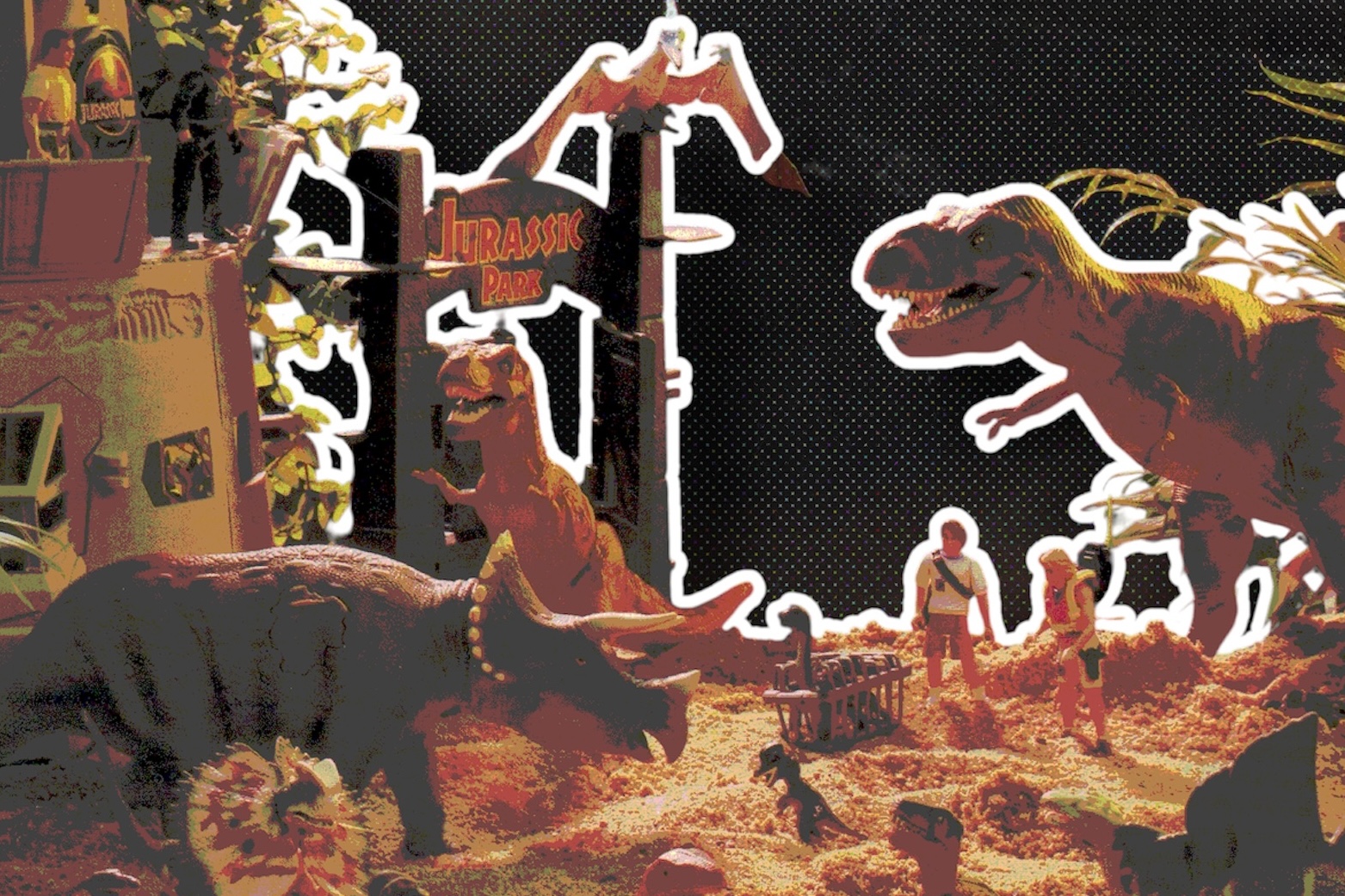
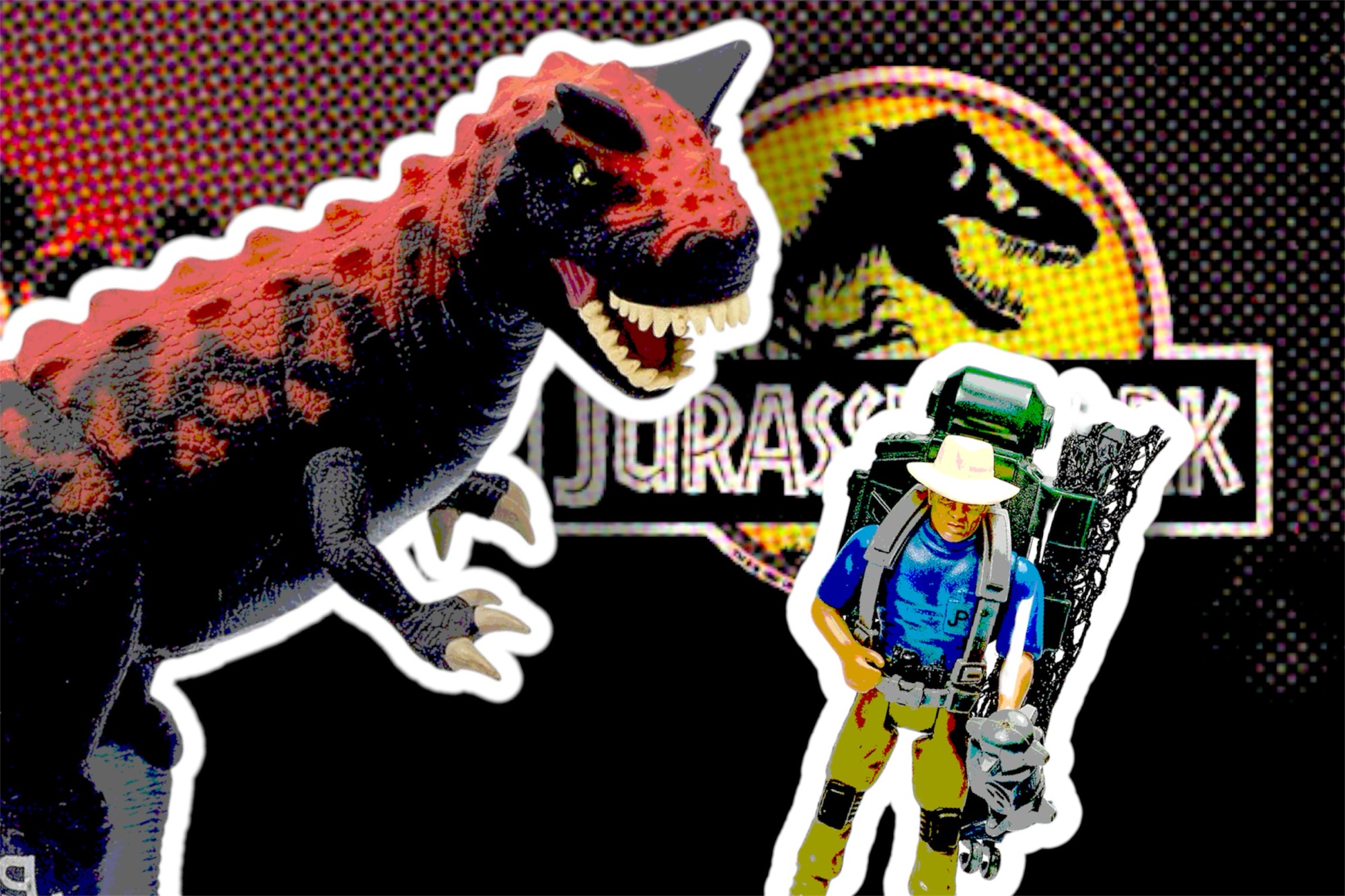
Here are some of our favorite designs from the Jurassic Toys collection that echo a forgotten era: